 1. Ontario is in the grip of a controversy for the new version of the trillium being proposed by the McGuinty government. The original trillium design as the visual identification for the government has been around since 1964. (right)
The new version (left) has been called three men in a hottub.
2. So too in Manitoba has there been controversy over logos and wordmarks. in this case the province created a new workmark "Spirited Energy" to replace "Friendly Manitoba".
The new wordmark could suggest that Manitoba's drive is derived from an attachment to a belief in ethereal beings - i.e. they have a hard time dealing with reality - or from a drive to the local liquor store, again suggesting a difficulty with reality.
The old one just suggested a place that was very generous with its affections.
Manitoba needs to go back to the drawing board.
3. Surprisingly, not every Newfoundland and Labrador logo has been replaced, even the sites run by the provincial government.
- As of Thanksgiving Monday, the government's business development site, nlbusiness.ca, is devoid of the new business-attracting logo. This situation still exists even though the provincial government's own website - gov.nl.ca changed on the day of the announcement. Government's job ads had a new format this past weekend as well.
-
 Ditto for the tourism site, even though the new Danny-mark is supposed to lure more tourists here, what with its innate "quirkiness" and all. Nope, newfoundlandandlabradortourism.com is still using one of the many other old logos (left) instead of the new Danny-logo.
Maybe they didn't get the memo.
-
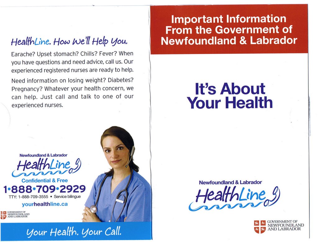 Same could be said of the crowd responsible for the health help line. Friday's mail brought a little information package including some telephone stickers and a cheap fridge magnet. (right) Will these have to be re-printed and at what cost?
And a gajillion instances of the old government logo (left).
 For the purposes of illustration, we have taken the logo and adjusted it slightly to take out the words "Government of". The main part of this logo is the shield from the province's coat of arms, granted in 1638.
Compare this one to the Little Logo of Horrors version currently sanctioned from on high.