As we approach the umpteenth anniversary of the internationally-accessible Internet, a website is about as far from news as anyone can get.
That’s why it was so laughable last week to see the junior fart-catcher apprenticed to the province’s minister of secrecy and obfuscation issuing a news release and holding a news conference to herald a completely trivial event like the launch of a new front page (!) to a website..
The only thing left for Steve Kent to do is invite the representatives of the province’s news media to gather ‘round as he opens an envelope. Even the Voice of the Cabinet Minister might not attend that sort of snore-fest or the subsequent events in the series: Kent to check e-mail and Kent posts Twitter message.
Now right off the bat, let’s say it is nice to see the provincial government updating its website. The old design was incredibly old and probably dates back a dozen years. It was optimised for monitors that pretty much didn’t exist any more.
Now for the sad bits.
Slower than Dial-up
This is just the latest in a series of renovations to the government web presence that go back years. It is taking longer to renovate the government web site than it took to overhaul the whole Confederation Building physically in the 1980s and 1990s
Most departments have shifted by now. The House of Assembly site remains out of step and the news release space is still vintage 1999.
Obsolete
Kent mentioned the fact that the front page has been redesigned to highlight government information people are looking for. That would be a good thing, except that the information itself remains mired in the distant Internet past.
As SRBP told you in 2009, company searches, deed searches, lobbyist registry and similar spaces are optimised for browsers that don’t exist any more. That’s still the case.
Here’s a screen capture of the warning page SRBP got on March 3, 2013 using a Chrome browser.

The only difference from the screen that cropped up in 2009 was that the programmers removed the copyright date. It used to give a 2000 copyright date and a last update in 2003.
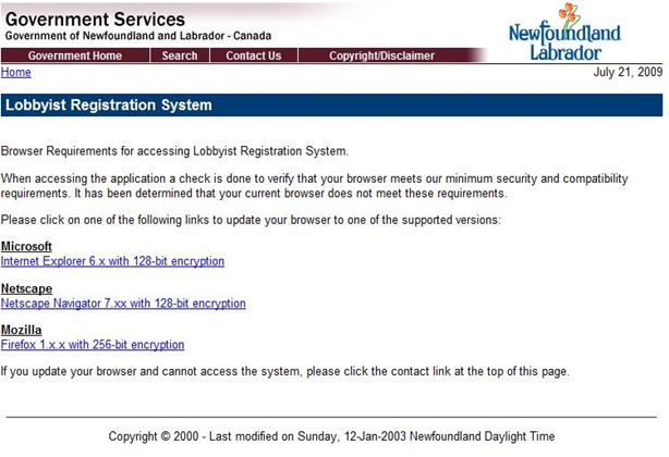
Other than that, the warning still covers obsolescent version of Internet Explorer and Firefox and recommends Netscape Navigator, unavailable since 2007.
What is this – how do you say – “mobile device”?
Anyone with a smartphone or tablet will know that the provincial government’s Internet presence is hopelessly mired in the desktop PC world of Bill Gates from the mid-1990s. That’s great if you have a big screen and lots of computing power and memory space to process all the shiny graphics. It sucks if you don’t.
More sophisticated Internet spaces like those of the news media offer their content in formats that are more text heavy. They also have re-organized their web pages to reflect that world.
Try usa.gov, the main American federal government web page as a case in point. Lots of text. Lighter on the graphics. Right up at the top is a gigantic search box that let’s the user find stuff very easily. For people who want to poke around, there are simple groupings. It’s not pretty because it is designed to be functional and light

Another example of this philosophy is ontario.ca, the Ontario provincial government’s front page. There might be a big picture, but the thing you’ll notice is the search box. Scroll down and you will find tabs to take you to more information.

Below the bit in that first picture is a simple link to the current Premier, contact links including Twitter, and a list of topic links that will take you off to more information. This is an incredibly lean presentation but it reflects a very sophisticated approach to giving the visitor what they are looking for in as easy a way as possible.
Visually, the page is uncluttered and very clean. People aren’t likely to get pissed off by all the text to wade through when they are trying to find something. They likely won’t spend much time trying to figure out how the web site files information away. That’s because, like all good Internet spaces, someone in Ontario spent a huge amount of time wiring things together in a way that fits with the way people look for information.
What Kent said and what they did are two different things
Now compare that to the new front page Kent unveiled.

Compare this picture with the usa.gov and the ontario.ca pictures. What do you see first? What catches your eye?
These relatively small pictures highlight the fundamental design characteristic of the Newfoundland and Labrador government website: it’s been developed for the people who own the site, not for the people who will use it.
The easiest thing to read is that enormous quote up at the top. This one is about Muskrat Falls. There are quotes and pictures for several different themes.
Nice stuff but it doesn’t reflect what Steve Kent said during his news conference. As reported by the Telegram on Friday Kent said that
… the new homepage … is easier to navigate and designed to highlight the most used features — the most visited part, he said, is the highway traffic camera section. Those and other popular features — including vehicle registration renewal and ferry schedules — are more prominent on the homepage, with programs being broken down, where appropriate, into information for residents, visitors and businesses.
 Even if you look at the page layout itself, that information is way down the page. The designer put a set of text links in the upper left portion of the page. That’s where eyes tend to go, but the first thing is a title – Quick Links – that doesn’t do anything. It’s unnecessary.
The next one down is the “Home” link to take you back to the main page. It’s basically in the wrong place.
Then you have a list of links to departments, news releases, the government telephone directory, publications and services.
It’s only then that you get to a list of potential things users might want like paying a fee, checking on a student loan or finding a job.
Keep going. You will have to scroll down to get links for most of the stuff Kent mentioned.
Simply put, the page violates the basic principles of web page design, if you are designing it for the user as opposed to the site owner. This post highlights some really basic ones. There’s more to this than it might appear. Later this week, we’ll come back to the government Internet presence and see what else it reveals both about the design and about the government’s fundamental management and communications problems.
-srbp-