People have hung election signs on it for as long as the Waterford Hospital has had it there at the edge of its property at the intersection of Cowan Avenue and Waterford Bridge Road.
Those signs are gone now, apparently at the request of the regional health agency.
The hospital used to be well out in the countryside but as the city grew around it, the fence became a highly visible feature on one side of a busy intersection.
The federal riding used to be St. John’s West. These days it’s called St. John’s South - Mount Pearl. Some people think it is too close to call at the moment. Your humble e-scribbler agrees and as the election wears on, the actual battle seems to be going on between the New Democrats and the Conservatives for the provincial Conservative vote.
Now some of you are thinking that doesn’t make any sense. Just remember though, that voting in St. John’s is not along some left/right ideological axis. Something else drives it.
The New Democrats are fired up though. Some of them have a personal hate on for Liberal incumbent Siobhan Coady. It turns up in all sorts of ways, not the least of which is one twitter idiot who tries spam-bombs Coady’s twitter feed. All he does is show just exactly how much an an amateur pol he is. Hint: spamming only shows you are a professional horse’s arse.
But anyway…
Before the signs disappeared, the corner of Cowan and Waterford Bridge Road was a good spot to see local political signage. The centrepiece of the affair was a big four by eight Coady affair that went up before the ink was dry on the writ. The Grits have been aggressive, if nothing else.
The Dippers countered with a batch of four by fours with the name “Jack Layton”, the candidate in some Toronto riding. The local guy – Ryan Cleary – got a bunch of two by twos of the kind usually mounted on lawns. You can see the spread in the picture.
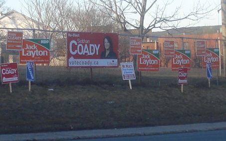
Now from a design standpoint, there are two things to notice here.
First, look at the good sign design ideas. Coady’s big sign makes her name the largest thing. it’s visible from quote a distance. Her web address is there as well. The picture’s a throw-away but overall this is a well designed sign.
The Layton signs are the current NDP design and they are good. The last name of the candidate is prominent and can be seen easily seen at a distance. They don’t show as well at night as they should but that’s a separate issue.
Problem – and here’s the second thing – this layout wasn’t a good thing for Cleary. His two bys are the older type he used the first time he ran. There’s so much other info on the sign, they made his name too small to be seen at any serious distance.
The fact that Jack’s signage overwhelmed Cleary only compounds the problem and just doesn’t make any sense. Jack isn’t a vote draw. The fact they plastered the space like wings on Coady’s big sign only made hers stand out even more. That just compounded the basic problems with their signage.
Cleary’s new signs are better: they profited by following the template national design but their night-time visibility is still worse than the other parties’ signs.
 When the Connies showed up, their small verticals were too small to show the candidate’s name – Loyola Sullivan – in a way anyone could read. They fixed that problem with the four bys that went up later. The Dippers responded by a volume attack, again, that really didn’t do anything to give them greater prominence, visibility or anything else.
Just to finish it off, a local lawn care guy got into the act. Maybe Mr. Mulch is running for the Greens.
Don’t laugh too soon, though. You can use his signs to show just how much experienced political types have developed signs that use experience to deliver effective signs. Mulch, by contrast is burdened with all sorts of detail. The result is a sign you cannot read unless you right on top of it. Given that people read most of these signs in their cars, they’ll see Mulch as they speed by and certainly without having the time to get the telephone number to call or his website.
- srbp -